 |
||

RESIDENTIAL INTERIORS
Very, Very. Extraordinary
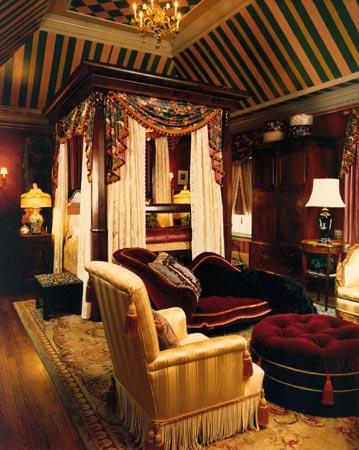
This room began with a fabulous 19th Century four poster bed, a chair or two and the client’s wish for a glorious and indulgent master bedroom suite. The other given was the tray ceiling. Not an architectural favorite of mine, I decided to apply some pattern and transform it into a tent just a bit reminiscent of Brighton Pavilion. I began the scheme with a wonderful Clarence House glazed chintz having a deep claret background and masses of cabbage roses. This was used on the swags and cascades from the bed’s crown as well as the treatments over the window drapery and as side panels at the tub in the master bath. The bedspread was antique lace that we lined with ecru satin to give it some stability and the lace panels were european lace from Decorator’s Walk.
The walls above the wainscot were papered in a claret porphyry pattern and below in a Brunschweig & Fils, tone on tone patterned stripe of the same color. The wall surfaces were glazed with a satin finish. The chairs and victorian reclining couch in the seating area are luxed to the max with Clarence house velvets and striped tone-on-tone satins, trimmed with deep bouillon fringe and welted with plush moss fringes. The 19th century rosewood corner cabinet hides a television, just to keep the centuries separated.
Happily the client was interested in the details and aware of how much they meant to the overall look of the room. Small paper borders were added in and below the crown moulding, lace borders were applied the the bed’s lace panels and two rows of fringe were added to the edges of the chintz treatments. The silk shades on the porcelain lamps flanking the bed were hand made by an Atlanta artisan named Brent Wisenant and all the drapery treatments were executed by Atlanta’s premiere drapery workroom, George & Associates.
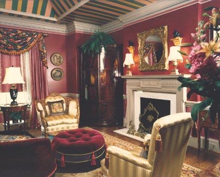
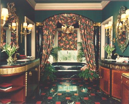
The intent of course was to make the adjoining master bath an extension of the bed-sitting room. The walls here were papered in a Brunschwig & Fils green striae and the ceiling painted to match, the rich green being a compliment to the plum of the walls in the main room. The Clarence House floral chintz was again used for drapery treatments and shades in the tub area. The floors are a deep green-black marble set on a diagonal with inset cabochons of ruby tile. This treatment was carried into the toilet compartments as well. Although striving for a sense of symmetry the his (on the left) and hers (on the right) vanity areas, they are fitted with different but compatible cabinets, both antiques refitted for the use. The Sheraton serving piece which serves as his vanity was modified by adding Empire moulding from Decorator’s Supply which was hand leafed to repeat the gold on her vanity. The tops are fashioned from slab material of the same verde marble as the floor. His mirror is gilt and hers Venetian. To add interest to the area around the tub we created an arch and added columns which were marbleized to match the material in the floor.
From the beginning to the completion of this project, attention to detail and an expression of luxury were the defining parameters.